Forums
https://www.decware.com/cgi-bin/yabb22/YaBB.pl
AUDIO FORUMS >> General Discussion and Support >> LOGO DESIGN for ZENAMPS
https://www.decware.com/cgi-bin/yabb22/YaBB.pl?num=1320795058

Message started by Steve Deckert on 11/08/11 at 23:30:57

Title: LOGO DESIGN for ZENAMPS
Post by Steve Deckert on 11/08/11 at 23:30:57

Sorry about the prior thread, I blew it up by mistake.  We had a logo contest for a new web site I'm planning called zenamps.com  (Zenamps.com will be another web site to sell our amplifiers) We took the winner logo from the contest and came up with the following:


Title: Re: LOGO DESIGN for ZENAMPS
Post by Steve Deckert on 11/08/11 at 23:36:52

This logo was the result of 125 submissions by 31 designers.  The process took 2 weeks.  Now with this  as a baseline I'm trying to come up with something better - emphasize "trying"!

So I will be tossing rough drafts into this thread for your comments.

Thanks,

Steve Deckert

Title: Re: LOGO DESIGN for ZENAMPS
Post by Steve Deckert on 11/08/11 at 23:39:10


This one is less impressive in white so far... that's why I haven't taken the time to make a white one.

Title: Re: LOGO DESIGN for ZENAMPS
Post by Steve Deckert on 11/08/11 at 23:39:59


Title: Re: LOGO DESIGN for ZENAMPS
Post by Steve Deckert on 11/08/11 at 23:40:44


Title: Re: LOGO DESIGN for ZENAMPS
Post by Steve Deckert on 11/08/11 at 23:41:11


Title: Re: LOGO DESIGN for ZENAMPS
Post by Steve Deckert on 11/09/11 at 00:43:43


Title: Re: LOGO DESIGN for ZENAMPS
Post by Lon on 11/09/11 at 01:37:49


Call me old-fashioned but because the site is ZenAmps, I think that the logo should incorporate an amp. I believe that this one comes closest to showing an amp, although it doesn't seem to really, so it gets my vote. Best of luck with the site!

Title: Re: LOGO DESIGN for ZENAMPS
Post by Steve Deckert on 11/09/11 at 03:50:48


This might be my best effort so far... got rid of the performance car parts feel.


Title: Re: LOGO DESIGN for ZENAMPS
Post by Steve Deckert on 11/09/11 at 04:25:00


This one's a bit crudely done... but I did say these were rough drafts.


Title: Re: LOGO DESIGN for ZENAMPS
Post by will on 11/09/11 at 05:43:11

I am really liking the direction of the one on black #8. I agree. It is starting to feel like the feel of your amps. The Zenamps letters (especially the black) on the white back (#9) lacks the dimension and richness of the Zenamps on the black...the black letters being pretty flat.

There is balance on the black back one, the depth and transparency of the letters complimenting the dimensionality of the globe. And the overall richness conveys the vibe of the amps while being visually seductive.

I wonder about somehow bringing the bronze, silver or yellow, or all of the above from the the globe into the Zen on the white back one...like bordering the black of the letters or filling the interior while keeping the black edges or something like this to add depth??? Don't know, but I think you are on it! I like all of these better than the original online choices.

Title: Re: LOGO DESIGN for ZENAMPS
Post by Brett on 11/09/11 at 06:09:13


I'd like to take a stab at this...

Having a clean logo is in keeping with the zen tradition.

Could we try this with the orange "Z" removed from the chrome circle around the tube pic?

I think you should keep this image of tubes within the circle because it is much more easily recognized by people new to tube audio and conveys the crystal clean warmth of tubes against the pitch black background.

Also I'd like to see the "amps" portion of the zenamps logo a solid color matching the red bases of the tubes. The left portion of the "a" in "amps" is very close.

Remove the motto and the ".com" and you have a perfect logo IMO. The motto is better suited within the overall web site experience.


Title: Re: LOGO DESIGN for ZENAMPS
Post by Steve Deckert on 11/10/11 at 01:50:18

I have to admit that after a long day - doing this for a bit in the evening with a good Scotch and some great music on the stereo is most relaxing...  and quite a bit more productive than watching TV.  

Here's a few more...


Title: Re: LOGO DESIGN for ZENAMPS
Post by Steve Deckert on 11/10/11 at 01:51:06


The color balance needs a bit more work but this one has some potential.


Title: Re: LOGO DESIGN for ZENAMPS
Post by Steve Deckert on 11/10/11 at 01:55:00

Of corse, not that anyone ever will, but seeing it BIG is kinda fun...


Title: Re: LOGO DESIGN for ZENAMPS
Post by Steve Deckert on 11/10/11 at 01:59:21


...without the tagline


Title: Re: LOGO DESIGN for ZENAMPS
Post by Steve Deckert on 11/10/11 at 02:10:47


Well I'm not going to get anything better than this tonight... time to float in some music!


Title: Re: LOGO DESIGN for ZENAMPS
Post by Steve Deckert on 11/10/11 at 02:19:05

OK, That deserves one more BIG one!  Only because I think I've seen this very orb making a crop circle once!


Title: Re: LOGO DESIGN for ZENAMPS
Post by Lon on 11/10/11 at 02:46:36

Is there a (planned?) Zen amp with that tube? ;)

Title: Re: LOGO DESIGN for ZENAMPS
Post by Steve Deckert on 11/10/11 at 03:25:30

Oh fine... let the cat out of the bag...  This is the new zen amp.  It levitates over the carpet in you room and does not require speaker wires, it just sends energy to your speakers.  Don't need interconnects or even a source because it can read your mind and just play whatever music you're thinking of!  Naturally a power cord is also not needed.  Truely a future product.

Steve :)

Title: Re: LOGO DESIGN for ZENAMPS
Post by walt on 11/10/11 at 04:33:55

I like (in order of preference)  #2 (I love the mercury vapor tube), #8 and #6.

Title: Re: LOGO DESIGN for ZENAMPS
Post by will on 11/10/11 at 07:31:16

Looks great, like fun, and like you are deep into the refinement mode! The big globe is beautiful.

Title: Re: LOGO DESIGN for ZENAMPS
Post by 4krow on 11/10/11 at 14:56:55

I'm still with the black background. It has a grounding to it. no pun intended.

Title: Re: LOGO DESIGN for ZENAMPS
Post by Steve Deckert on 11/10/11 at 15:49:07

Whatever logo is chosen HAS to work well both on Black and on White.  I'll see how this last one looks on black when I get more time.

Title: Re: LOGO DESIGN for ZENAMPS
Post by will on 11/10/11 at 19:42:40

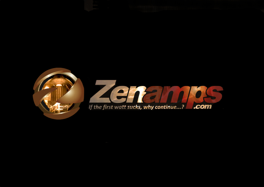
I was confused. I figured there was a black background and white back one.... working variations on the "same" but intended for different backgrounds. Needing it to be exactly the same for all backgrounds....Ouch.

I think the last one (#16) is really nice considering the much more difficult white background. I do find the breakup of some of the 1st watt phrase letters disconcerting. And as-is I would think...just maybe, it could show on black, but could get lost, for example on this webpage background.

Assuming these are for advertising on web and perhaps on paper, shirts etc, I would think it would be fine to have two variations, one adapting the lettering coloring to light backing and one for dark, as long as they were clearly the "same" logo, with the same globe, type, layout and feel. With these conditions, in the independent experience of them popping off light, or popping off dark, I don't think I would even think about questioning that they were the same thing. But I am no logo expert.

If they need to be exactly the same on light or dark backs, I guess you have already tried this, but does the black background one (#8) work on white? Maybe either 8 and 16 will work on either background with some light tweaking. I also wonder about #8 with the orange letter coloring in the Zen and its lighter color in amps.

Title: Re: LOGO DESIGN for ZENAMPS
Post by Steve Deckert on 11/11/11 at 01:12:12

Here is an easier to read tag line per Will's suggestion.


Title: Re: LOGO DESIGN for ZENAMPS
Post by Lon on 11/11/11 at 01:35:09

Personally I don't see what that tube has to do with Zen Amps, but it does look cool. I'd rather see part of a Torii or the Zen Monoblocks in that image, I think that would represent the amp site better. But that's just me!

Title: Re: LOGO DESIGN for ZENAMPS
Post by Steve Deckert on 11/11/11 at 03:09:55


Here is an attempted black version of it...


Title: Re: LOGO DESIGN for ZENAMPS
Post by Steve Deckert on 11/11/11 at 04:03:09

Yup,  I knew I saw this orb making a crop circle...


Title: Re: LOGO DESIGN for ZENAMPS
Post by will on 11/11/11 at 05:31:31

I thought the tube orb looked familiar. Have you tried the new black back one on white?

Title: Re: LOGO DESIGN for ZENAMPS
Post by Steve Deckert on 11/13/11 at 04:53:22


No, but I will... got distracted in other areas of the forum...


Title: Re: LOGO DESIGN for ZENAMPS
Post by will on 11/13/11 at 17:17:23

Yes, Nice work over there!

Forums » Powered by YaBB 2.2.2!
YaBB © 2000-2008. All Rights Reserved.